
How MileIntel's Transfer Graph Actually Works
TL;DR
MileIntel's transfer graph is a three-layer system that tracks airline and hotel transfer partnerships for points currencies, detects changes through automated verification pipelines, and recalculates optimal redemption paths for users whenever new partnerships are added.
Key Takeaways
- Transfer partnerships are modeled as a graph where points currencies are nodes, transfer partners are edges, and ratios are edge weights—but maintaining accuracy requires human verification, not automation.
- The verification pipeline flags detected changes as pending records for manual review before updating the live graph, preventing scraper errors from corrupting the source of truth.
- A single partnership announcement like Wells Fargo adding Cathay Pacific triggers downstream re-ranking of redemption options for every user holding that currency.
- The system tracks both first_seen and last_verified timestamps for each partnership, ensuring MileIntel knows not just that a relationship exists, but that it's still current.
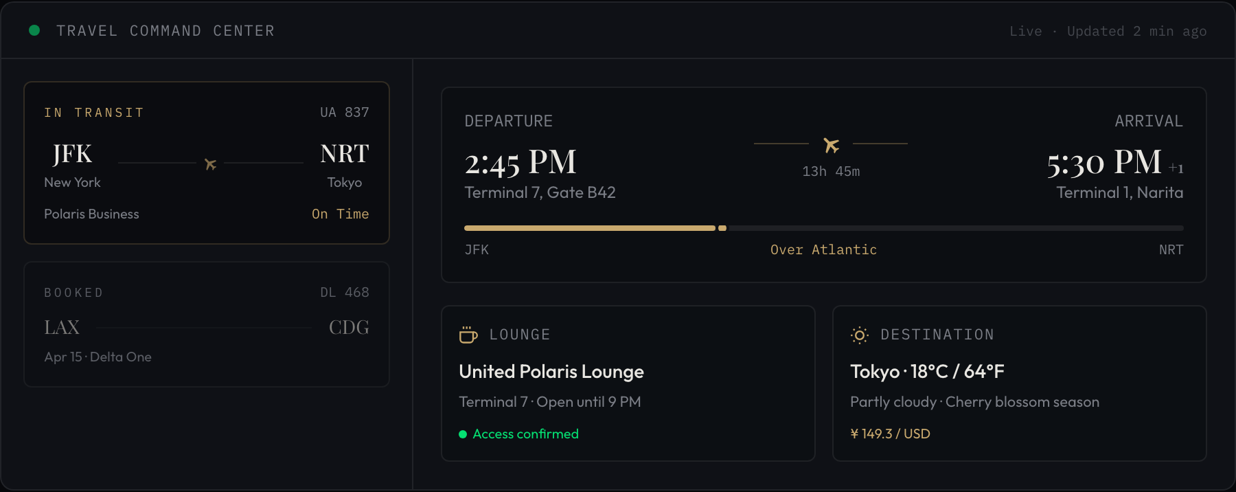
Wells Fargo announced something quietly on April 28th that most cardholders will never see: Asia Miles is now a 1:1 transfer partner. First Asia-focused partner in the program's history.
For most people, that news lives and dies in a press release. For MileIntel, it meant one thing immediately: our transfer graph needed to update, and every user holding Wells Fargo Rewards points needed to know they had a new redemption path to Hong Kong, Tokyo, and beyond.
That's the gap I keep coming back to. Not "loyalty programs are complicated" in the abstract. The specific, concrete gap between a partnership existing and a cardholder knowing it exists and understanding what it means for their specific balance.
So today I want to pull back the curtain on the piece of MileIntel I've spent the most engineering hours on and talked about the least publicly: the transfer graph.
What a "transfer graph" actually is
Every major transferable points currency — Chase Ultimate Rewards, Amex Membership Rewards, Citi ThankYou, Capital One, Wells Fargo Rewards — has a set of airline and hotel partners it can move points to. Those relationships have ratios (usually 1:1, sometimes worse), minimum transfer amounts, and processing times that vary by partner.
If you model this as a graph, your points currencies are nodes. Transfer partners are edges. The edge weight is the ratio.
That sounds simple. It isn't.
The first version I built was a static JSON file. Literally a hardcoded object: "chase" -> ["united", "hyatt", "southwest", ...] with ratios next to each. I shipped it in about four hours and felt clever.
It broke within two weeks. Citi quietly changed a transfer ratio. I found out from a Reddit thread, not from any official announcement. The static file had no way to know it was wrong.
The real architecture (and why it took 3 weeks, not 4 days)
The current system has three layers.
Layer 1: The source-of-truth store. A Postgres table with one row per transfer relationship. Each row holds the source currency, destination program, transfer ratio, minimum transfer amount, typical processing time in hours, and two timestamps:first_seen and last_verified. That last column is the important one. It's not enough to know a partnership exists. I need to know when I last confirmed it still exists.Layer 2: The verification pipeline. A set of scrapers and watchers that check program pages, parse terms-and-conditions updates, and cross-reference against a curated list of loyalty news sources. When a change is detected, it doesn't auto-update the graph. It creates a pending_change record and flags it for review. I got burned once by a scraper misreading a page layout change as a ratio update. Now nothing touches the live graph without a human (me, currently) signing off.This is the part that took the 3 weeks. Not the data model. The confidence system around the data model.
Layer 3: The user-facing query layer. When you tell MileIntel you have 80,000 Wells Fargo Rewards points, the system doesn't just look up "what can Wells Fargo transfer to." It runs a shortest-path query across the graph to find every reachable airline program, calculates the effective value at each destination using our cents-per-point estimates, and surfaces the top options ranked by value.The Wells Fargo → Asia Miles addition meant adding one edge to the graph. But it also triggered re-ranking for every Wells Fargo user in our system. That's the part that's easy to underestimate: a single partnership announcement has downstream effects across every user whose portfolio touches that currency.

The part that surprised me
I assumed the hard problem was data freshness. Keeping the graph current. And that is hard.
But the harder problem turned out to be conflicting sources.
When Wells Fargo announced the Asia Miles partnership, the official press release said 1:1. A major points blog reported it as 1:1 with a 1,000-point minimum. A different blog said 2,000-point minimum. The Wells Fargo rewards portal itself showed a third number during the first 48 hours before it was updated.
Three sources, three slightly different facts, all published within hours of each other.
My original system had no way to handle this. It would have taken the first source it saw and called it done. Now I weight sources by historical accuracy. Official program pages get the highest weight. Known reliable loyalty publications get secondary weight. Everything else is flagged as unverified until corroborated.
It's not a perfect system. But it's a lot better than "whoever I scraped first wins."
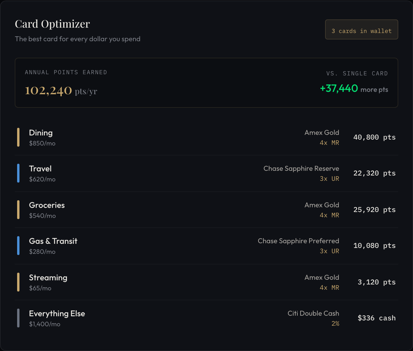
What this means for the card optimizer
The transfer graph feeds directly into the card optimizer, which I've been quietly building out over the past few weeks. The optimizer looks at your spending categories, your existing card portfolio, and your target redemption goals, then tells you which card earns the most useful points for your situation.
Useful is the key word. A card that earns 3x on dining is only valuable if those points can reach the programs you actually want to fly. The transfer graph is what makes that calculation possible.
With the Wells Fargo → Asia Miles edge now live, the optimizer can correctly identify that a Wells Fargo cardholder who wants to fly Cathay Pacific business class has a viable path. Before April 28th, it couldn't. That's not a small thing. Cathay Pacific's business class to Hong Kong is one of the best redemptions in the game, and it was effectively invisible to Wells Fargo cardholders in our system.

Where the graph stands today
That 48-hour average bothers me. The Wells Fargo announcement took about 31 hours from press release to verified and live, which I was reasonably happy with. But some updates have taken longer when sources conflict and I'm waiting for corroboration. I want to get the average under 24 hours by end of Q2.
The 17 ratio changes is the number I find most interesting. That's not 17 new partnerships. That's 17 times an existing relationship quietly changed its terms in 90 days. Most of those changes were small. A few weren't. None of them made headlines.
This is exactly what I wrote about back in the Citi ThankYou post: the changes that matter most are the ones that happen without fanfare. The transfer graph is how we catch them.
What I'm still figuring out
The graph handles direct transfers well. What it doesn't handle well yet is multi-hop paths.
Some redemptions require moving points through an intermediate program. Transfer currency A to program B, then use program B's miles to book on airline C. These paths exist. Frequent flyers know about them. Our system currently doesn't model them because the complexity of validating multi-hop paths without surfacing bad advice is genuinely hard.
I've been thinking about this for two months. I don't have a clean answer yet. If you've thought about this problem, I'd genuinely love to hear how you'd approach it.
If you want to see the transfer graph in action for your own points balance, the transfer partner tool is free. No account required. Plug in your currency and balance and see where your points can actually go.
And if you're a Wells Fargo cardholder sitting on points: Asia Miles is now on the table. Cathay Pacific business class to Hong Kong runs 70,000 miles one-way. Worth knowing.
Get articles like this in your inbox
The Mileage Run — one short email when something actually changes your travel math. No filler, no affiliate trash, no spam. Unsubscribe anytime.
Frequently Asked Questions
What is a transfer graph in the context of loyalty points?+
A transfer graph models points currencies as nodes and their airline/hotel transfer partnerships as edges, with edge weights representing transfer ratios. This structure allows the system to calculate every reachable redemption destination from a given points balance and rank options by value.
Why can't MileIntel just use a static list of transfer partnerships?+
Transfer ratios and partnerships change frequently without official announcements. MileIntel discovered this when Citi quietly changed a transfer ratio and the team only found out from a Reddit thread. A static file has no way to detect or reflect these changes.
How does MileIntel verify that transfer partnerships are still active?+
The system uses scrapers and watchers to check program pages, parse terms-and-conditions updates, and cross-reference loyalty news sources. When changes are detected, they're flagged as pending records for human review before updating the live graph, preventing automation errors from corrupting the data.
What happens when a new transfer partnership is announced?+
Adding a new partnership like Wells Fargo to Cathay Pacific means adding one edge to the graph, but it also triggers re-ranking of redemption options for every user holding Wells Fargo Rewards points, surfacing new paths to destinations they couldn't reach before.
Don't Miss a Departure
Track your miles, catch devaluations before the blogs do, and find the best use of every point you have.
Create Your Free AccountSign up with Google · No credit card required